React UI Component Library | The ultimate collection of design-agnostic, flexible and accessible React UI Components.
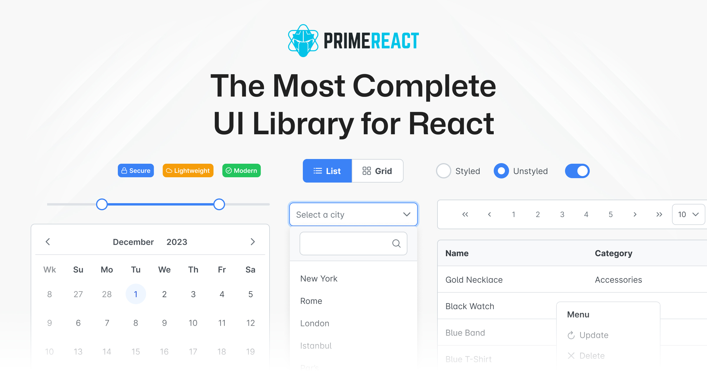
80+ UI Components
A comprehensive set of impressive React Components to enhance web applications.
Styled or Unstyled Options
Choose from pre-built themes or implement custom design systems.
Accessibility Compliance
Meets Web Content Accessibility Guidelines (WCAG 2.0) for inclusive design.
Enterprise Support
Exceptional support with quick response times and enhancement requests.
PrimeReact is a powerful UI component library designed for React.js, providing a rich suite of customizable and feature-rich components. It enables developers to elevate their web applications easily, turning their ideas into reality. With over 80 different UI components, it caters to a variety of design needs, allowing for both styled and unstyled implementations to fit any project.
Supports Typescript with tooling assistance, designed for mobile-first responsive applications, and offers 400+ pre-designed UI blocks for rapid app development.
Building complex web applications with customized user interfaces.
Creating accessible applications compliant with WCAG standards.
Rapid prototyping with pre-designed UI blocks.
Users can choose from various themes including material, bootstrap, and tailwind, or create their own.
Yes, PrimeReact offers extensive support for Typescript.
Enterprise support is available, promising responses within one business day.